
The New USDA Dietary Teaching Tools Include No Food
![]() By
Natalie Moore
Posted January 13, 2016
By
Natalie Moore
Posted January 13, 2016
- The USDA substitutes pixelated shapes for food on its new answer to the food pyramid
- Water icon? No way. No precise beverage suggestions for the U.S. despite public health requests
- If you want to learn how to eat actual food, go to Brazil.
Dear Reader,
The USDA launched new Dietary Guidelines last Thursday.
The USDA reviews and updates the guidelines every five years. Revisions stem from a systematic review of food, public health, and nutrition studies conducted between 2010–2015.
Considered to be the U.S. government’s official voice on what you should eat, the guidelines determine things like food nutrition labels and school lunches and serve as teaching guides for proper nutrition.
Since the dietary guidelines document is a bit wordy and uses complex ideas like “A Social-Ecological Model for Food and Physical Activity Decisions,” the USDA launched an infographic called MyPlate and a tipsheet called MyPlate, MyWins alongside the guidelines.
The goal of MyPlate is to illustrate what portions should look like on a dinner plate. This image will be in schools, hospitals, and other public places, reminiscent of the old food pyramid.
While the concept seems simple and effective, it was poorly executed.
Today, we will use the new sugar guideline as an example to take a closer look at the MyPlate, MyWins tipsheet and the MyPlate infographic.
Bittersweet Suggestions
The 2016–20 version suggests Americans limit their sugar intake to 10 percent of their daily diet. This equals about 12 teaspoons.
Currently, 23 teaspoons of sugar is the daily average for many Americans. The new guideline requires many to slash their daily sugar consumption in half based on a 2,000-calorie diet.1
And while this new dietary standard is much clearer than the 2010 loose suggestion of “reduce the intake of calories from added sugars,” it remains a far cry from what the American Heart Association (AHA) considers a healthy amount of daily sugar.2
In fact, the AHA suggestions no more than six teaspoons of sugar for women, half of the new USDA recommendation, and nine teaspoons for men.2
Here’s a common issue — a 20 oz. Coke has 15 teaspoons of sugar in it.
If a person drinks just one of these conveniently vending machine-sized sodas, they are instantly over the USDA sugar suggestion by one-third, and at the combined sugar intake for a man and a woman by AHA regulations.
So if you look at MyPlate, it appears as if the USDA took a step in the right direction — obscure, but still in the right direction on the soda issue.
Even though it’s in the limit category and not a part of the actual meal, the MyPlate tipsheet plainly states, “Drink water instead of sugary drinks.”
Notice the last bullet under the “Limit” box.
Source: United States Department of Agriculture.
This seems like a win for public health.
And in a way, it is. But it’s like placing fourth in an Olympic event.
Especially since a panel of nutrition experts and public health scientist begged the USDA to not just say “drink water.” They requested the USDA add a water icon to the official MyPlate infographic.4
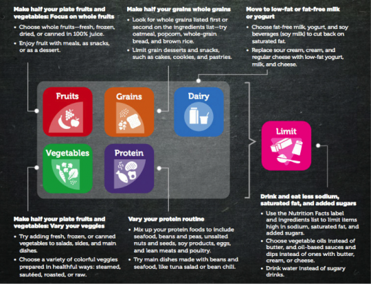
This the current edition:
![]()
Not only is there no water icon, there is no beverage icon at all.
Which brings us to the biggest issues with the USDA’s tipsheet and infographics — why are some food/beverage categories missing, and why are there computer-generated icons and not images of actual food in these teaching tools?
Protein doesn’t look like a pixelated purple triangle! It looks like a steak or bowl of beans.
How can the government expect us to know what to eat if they can’t even show us food!
Particularly when sugar, the biggest dietary culprit in America, isn’t even represented on the plate.
This makes no sense.
I am not advocating for sugar as main food group but it is fact that many Americans will continue to drink soda and eat sugary sweets.
Why not show us what is an appropriate amount?
Not to mention depictions of actual-sized examples may help people make better choices. Perhaps you would choose a 6 oz. Coke containing only a fraction of the sugar of the 20 oz. blood sugar-blasting version if you knew what that looked like or could make a comparison.
Or better yet, perhaps if you could see that a banana is better choice than a soda, you would choose the banana.
Bottom line: It is very hard to understand a proper portion size if all you are looking at is a Tetris-like dinner plate graphic where all of the food groups are not symbolized.
And it seems the experts agree.
Marion Nestle, a New York University nutrition professor, sums it up to NPR :
It’s ugly and it’s hard to read.
And she is right.
Nestle went on to explain to NPR she wishes “the government’s visual messaging on what Americans should and shouldn’t eat was much more explicit.”5
Other countries, like Sweden and Brazil, have more user-friendly guidelines. These easy-to-follow instructions and pictures of actual food make for valuable teaching tools themselves and eliminate the need for supplemental tip sheets and infographics.
In fact, Brazil even provides meal suggestions. Here is what lunch looks like in Brazil:
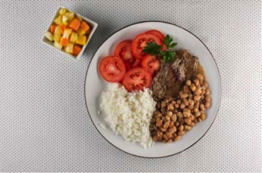
Tomato salad, rice, beans, grilled beef, and fruit salad.
Photo Credit: Brazilian Dietary Guidelines.
Wow, the fruit salad didn’t even make in on the plate and I still clearly understand the portioning!
While this doesn’t have a direct example of sugar on the plate, the guidelines include easy yet thorough explanations of high-sugar foods and also explain that fruit has natural sugars. But the best part: All of their meal photos include appropriate and relatable fruit serving sizes.
And they make helpful suggestions like “eating in company,” instead of the aforementioned USDA “A Social-Ecological Model for Food and Physical Activity Decisions” advice.
If you want to see more meal suggestion involving actual food, you can download a copy of the Brazilian Dietary Guidelines here.
I suggest it over the USDA’s MyPlate any day.
The full version of the USDA guidelines does offer a few serving suggestions with pictures for cup and ounce equivalents and has a chart of a breakfast meal, but no pictures of plated meals.
If you have anything to say about the new dietary guidelines, drop me a line. Nmoore@lfb.org
Live well,

Natalie Moore
Managing editor, Living Well Daily
Sources
[1] Sugar: Too Much of a Sweet Thing
[2] Dietary Guidelines for Americans 2010
[3] Obesity Rates & Trends Overview
[4] What Might Be Missing From MyPlate? Water
[5] Uncle Sam Just Told Us To Drink Water, Not Soda. You Might’ve Missed It
[6] Dietary Guidelines for the Brazilian Population
Written By Natalie Moore
Natalie Moore is a dedicated health researcher with a passion for finding healthy, natural, and science-based solutions. After a decade of direct healthcare experience in western and natural medicine, she was involved in public health research before joining Living Well Daily.
View More Free Articles

Four Carbs that Could Add YEARS to Your Life
You’ve likely been avoiding carbs like the plague. Health gurus, fitness influencers, and diet books have convinced you that carbs are the enemy—that they spike your blood sugar, pack on pounds, and fast-track you to diabetes. So you’ve eliminated bread, sworn off pasta, and feel guilty just touching a piece of fruit. But what if...

Upgrade from Bananas and Apples to These Powerhouse Fruits
I’m often asked which fruits are the best. So, let’s talk about it. I’ll cut right to the chase: berries win this contest hands down. If you’re limiting your options to apples and bananas, you’re missing out on a universe of superior antioxidant power. Those everyday fruits are like bringing a knife to a gunfight...

The REAL Reason Americans are Getting “Fatter”
You’ve heard it a thousand times: “Americans are getting fatter because we’re lazy.” We sit at desks all day. We binge-watch Netflix instead of hitting the gym. We’ve traded physical labor for sedentary lifestyles. It’s a tidy explanation for why obesity has skyrocketed in developed countries. There’s just one problem—it’s completely wrong… A groundbreaking Duke...

Mailbag: Room Won't Stop Spinning? Do THIS First
“I’m dealing with vertigo issues, lightheadedness, and dizziness. As recently as this last Saturday I had multiple occurrences throughout the day. Is there anything I can do for this? I’m 69 and in good health. I work out 4 to 5 times a week.” —Spinning Hi Spinning, When patients approach me with similar complaints, I...

Hidden Number Secretly Sabotages Male Performance
Guys (and gals that love them), we should talk. You know how we’ve always been told that bedroom troubles are just part of getting older—that we just need to live with them? Well, it turns out that’s not true. Scientists recently wrapped up a six-year study that followed over 100 healthy men, and the findings...

Shocking Study Links Kids' Snacks to Dangerous Early Puberty
Kids are growing up in a world vastly different from the one we knew. Back in our day, if a child wanted something sweet, it was a piece of candy or a homemade cookie. Today’s kids are surrounded by products filled with artificial sweeteners that didn’t even exist when we were raising our own children....
Outdated Vitamin Guidelines Put Your Brain at Risk
If you’re like most people, you probably don’t think twice about vitamin B12—until your doctor mentions it during a routine blood test. But new research published in the Annals of Neurology suggests we need to pay closer attention to this crucial nutrient—especially as we age. Turns out, current guidelines for this essential nutrient might be...

The TRUTH About Supplement "Liver Dangers" REVEALED
There’s been a lot of buzz lately about liver damage from supplements—so, let’s talk about it. Reports of supplement-induced liver injuries have some folks wondering, “Could my natural remedy actually be harming me?” But before you toss all your supplements in the trash, let’s separate fact from fear—and talk about how to use supplements safely....

The 10,000 Steps LIE That's Ruining Your Health
I’ll be honest—I’m a little sick of the 10,000-steps theory. You know, the one that insists you need to take at least that many steps daily to stay healthy? You won’t believe where that claim originally came from. The 10,000-steps theory wasn’t handed down from the fitness gods on stone tablets. It originated from a...

“Brain Games” Failed You? Try THIS For Better Memory Instead
You know all those brain-training apps, supplements, and “miracle” memory-boosters that promise to keep your brain sharp as you age? Here’s the truth… There IS evidence they support brain health—and that’s why I’ll be the first to recommend them. But they aren’t the most powerful brain-boosting tool available to you. Another surprising solution has earned...