The New USDA Dietary Teaching Tools Include No Food
![]() By
Natalie Moore
Posted January 13, 2016
By
Natalie Moore
Posted January 13, 2016
- The USDA substitutes pixelated shapes for food on its new answer to the food pyramid
- Water icon? No way. No precise beverage suggestions for the U.S. despite public health requests
- If you want to learn how to eat actual food, go to Brazil.
Dear Reader,
The USDA launched new Dietary Guidelines last Thursday.
The USDA reviews and updates the guidelines every five years. Revisions stem from a systematic review of food, public health, and nutrition studies conducted between 2010–2015.
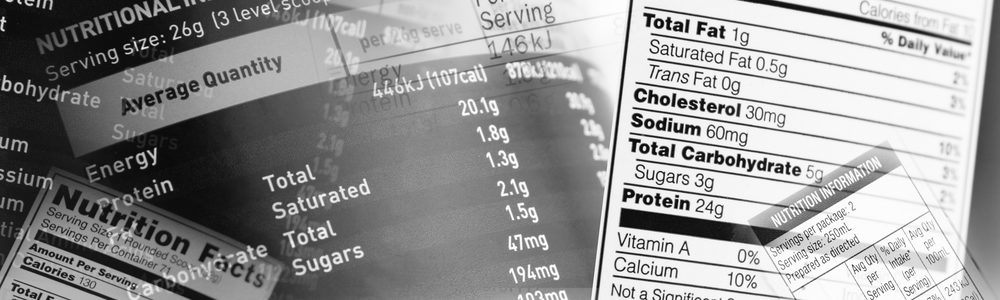
Considered to be the U.S. government’s official voice on what you should eat, the guidelines determine things like food nutrition labels and school lunches and serve as teaching guides for proper nutrition.
Since the dietary guidelines document is a bit wordy and uses complex ideas like “A Social-Ecological Model for Food and Physical Activity Decisions,” the USDA launched an infographic called MyPlate and a tipsheet called MyPlate, MyWins alongside the guidelines.
The goal of MyPlate is to illustrate what portions should look like on a dinner plate. This image will be in schools, hospitals, and other public places, reminiscent of the old food pyramid.
While the concept seems simple and effective, it was poorly executed.
Today, we will use the new sugar guideline as an example to take a closer look at the MyPlate, MyWins tipsheet and the MyPlate infographic.
Bittersweet Suggestions
The 2016–20 version suggests Americans limit their sugar intake to 10 percent of their daily diet. This equals about 12 teaspoons.
Currently, 23 teaspoons of sugar is the daily average for many Americans. The new guideline requires many to slash their daily sugar consumption in half based on a 2,000-calorie diet.1
And while this new dietary standard is much clearer than the 2010 loose suggestion of “reduce the intake of calories from added sugars,” it remains a far cry from what the American Heart Association (AHA) considers a healthy amount of daily sugar.2
In fact, the AHA suggestions no more than six teaspoons of sugar for women, half of the new USDA recommendation, and nine teaspoons for men.2
Here’s a common issue — a 20 oz. Coke has 15 teaspoons of sugar in it.
If a person drinks just one of these conveniently vending machine-sized sodas, they are instantly over the USDA sugar suggestion by one-third, and at the combined sugar intake for a man and a woman by AHA regulations.
So if you look at MyPlate, it appears as if the USDA took a step in the right direction — obscure, but still in the right direction on the soda issue.
Even though it’s in the limit category and not a part of the actual meal, the MyPlate tipsheet plainly states, “Drink water instead of sugary drinks.”
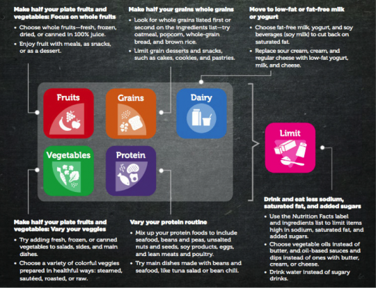
Notice the last bullet under the “Limit” box.
Source: United States Department of Agriculture.
This seems like a win for public health.
And in a way, it is. But it’s like placing fourth in an Olympic event.
Especially since a panel of nutrition experts and public health scientist begged the USDA to not just say “drink water.” They requested the USDA add a water icon to the official MyPlate infographic.4
This the current edition:
![]()
Not only is there no water icon, there is no beverage icon at all.
Which brings us to the biggest issues with the USDA’s tipsheet and infographics — why are some food/beverage categories missing, and why are there computer-generated icons and not images of actual food in these teaching tools?
Protein doesn’t look like a pixelated purple triangle! It looks like a steak or bowl of beans.
How can the government expect us to know what to eat if they can’t even show us food!
Particularly when sugar, the biggest dietary culprit in America, isn’t even represented on the plate.
This makes no sense.
I am not advocating for sugar as main food group but it is fact that many Americans will continue to drink soda and eat sugary sweets.
Why not show us what is an appropriate amount?
Not to mention depictions of actual-sized examples may help people make better choices. Perhaps you would choose a 6 oz. Coke containing only a fraction of the sugar of the 20 oz. blood sugar-blasting version if you knew what that looked like or could make a comparison.
Or better yet, perhaps if you could see that a banana is better choice than a soda, you would choose the banana.
Bottom line: It is very hard to understand a proper portion size if all you are looking at is a Tetris-like dinner plate graphic where all of the food groups are not symbolized.
And it seems the experts agree.
Marion Nestle, a New York University nutrition professor, sums it up to NPR :
It’s ugly and it’s hard to read.
And she is right.
Nestle went on to explain to NPR she wishes “the government’s visual messaging on what Americans should and shouldn’t eat was much more explicit.”5
Other countries, like Sweden and Brazil, have more user-friendly guidelines. These easy-to-follow instructions and pictures of actual food make for valuable teaching tools themselves and eliminate the need for supplemental tip sheets and infographics.
In fact, Brazil even provides meal suggestions. Here is what lunch looks like in Brazil:
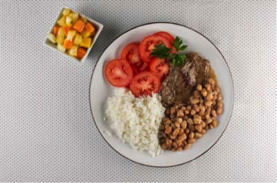
Tomato salad, rice, beans, grilled beef, and fruit salad.
Photo Credit: Brazilian Dietary Guidelines.
Wow, the fruit salad didn’t even make in on the plate and I still clearly understand the portioning!
While this doesn’t have a direct example of sugar on the plate, the guidelines include easy yet thorough explanations of high-sugar foods and also explain that fruit has natural sugars. But the best part: All of their meal photos include appropriate and relatable fruit serving sizes.
And they make helpful suggestions like “eating in company,” instead of the aforementioned USDA “A Social-Ecological Model for Food and Physical Activity Decisions” advice.
If you want to see more meal suggestion involving actual food, you can download a copy of the Brazilian Dietary Guidelines here.
I suggest it over the USDA’s MyPlate any day.
The full version of the USDA guidelines does offer a few serving suggestions with pictures for cup and ounce equivalents and has a chart of a breakfast meal, but no pictures of plated meals.
If you have anything to say about the new dietary guidelines, drop me a line. Nmoore@lfb.org
Live well,

Natalie Moore
Managing editor, Living Well Daily
Sources
[1] Sugar: Too Much of a Sweet Thing
[2] Dietary Guidelines for Americans 2010
[3] Obesity Rates & Trends Overview
[4] What Might Be Missing From MyPlate? Water
[5] Uncle Sam Just Told Us To Drink Water, Not Soda. You Might’ve Missed It
[6] Dietary Guidelines for the Brazilian Population
Written By Natalie Moore
Natalie Moore is a dedicated health researcher with a passion for finding healthy, natural, and science-based solutions. After a decade of direct healthcare experience in western and natural medicine, she was involved in public health research before joining Living Well Daily.
View More Free Articles

Is A Home Blood Pressure Cuff Worth the Money?
We all know that keeping blood pressure under control is crucial for heart health. If you’re like most people, you get yours checked every year at your annual physical. But should it be looked at MORE often? And is a home blood pressure cuff worth the investment? Keep reading to find out… I’ll get right...

Is Aspirin Really a Colon Cancer Fix? (Not So Fast!)
Stop me if you’ve heard this one before. Scientists discover a pill that might help prevent a serious disease. Sounds great, right? Well, not so fast. The latest “miracle cure” making headlines is none other than good old aspirin, which researchers now claim might help reduce colorectal cancer risk in people with unhealthy lifestyles. But...

Mailbag: Diarrhea Remedies That Really Work
“I have had diarrhea for 6 months. I’m going crazy and don’t know how to stop it! Please help!” – Can’t Stop Running Dear Can’t Stop, Few things disrupt life like battling a bout of diarrhea. Diarrhea is typically defined as having three or more loose, watery stools daily. If you experience this for over...

Take the SHORTER Path to Dramatically Better Health
Are you tired of fitness gurus preaching the virtues of 5 AM workouts and pushing Olympic-level training regimens? Their narrative can feel exhausting and entirely unattainable. But before you toss in the towel completely, I’ve got news that might just put a spring back into your step. A groundbreaking new study reveals that the key...

Unexpected Perks of Your Coffee Habit Revealed!
We all know that the first cup of coffee in the morning can FEEL like a lifesaver. But what if it might actually BE saving your life? A groundbreaking new study suggests that your daily coffee habit could be protecting you from not just one but multiple chronic diseases. Let’s pour over this fascinating research…...

The TRUTH About Diabetes Drugs and Brain Aging
You’ve probably seen the gushing headlines… Most say something like, “Common diabetes drug protects the brain against aging!” And let’s face it, that sounds fantastic. After all, who doesn’t want to keep their brain young and in tip-top shape? The headlines refer to the results of a new study that suggests the widely prescribed type...

Hidden Smartphone Danger Puts You at Risk
Remember when we thought cell phones were just something for young folks to obsess over? Back when we were convinced they were nothing more than a passing fad? Well, times certainly have changed. Now, most people… including many of us older folks… have jumped on the smartphone bandwagon. Heck, some of us are practically as...

Preserve Your Mobility with “Agile Aging” Exercises
Aging has a way of humbling us. You lose hair where you want to keep it—and often end up growing it where you don’t. With every passing year, your eyesight fades, and your waistline expands. And as your once quick pace begins to slow, you fear developing the dreaded “senior shuffle.” But here’s the thing....

Yes, Lazy Saturday Lie-Ins Can BOOST Your Health
Are you burning the midnight oil during the week and catching up on sleep on weekends? Well, I’ve got some news that might help you feel less guilty about those lazy Saturday mornings. A new study suggests that weekend lie-ins might be doing far more than just helping you feel refreshed. Experts say they could...

Mailbag: 7 Hidden Culprits Behind Your Weight Gain
“Why am I gaining weight, even though I am watching what I am eating?” – Battling the Bulge Dear Battling, Gaining weight when you’re not trying to is frustrating. And it just gets worse as we age… often regardless of our diet. The truth is that various factors can promote weight gain even when you’re...